Thursday, April 30, 2009

Sneak Peek + The booklet

So for the booklet, we discussed how it was to be put together and we've sorted it mostly out. I know you werent with us ashlee that day in studio so I thought I'd recap it and get some comment or any additional ideas as far as the booklet goes.

Put simply we thought the structure should be:

Who? Mission statement, what missive is and what the label embodies and other things fall into this first section.

What? What missive is offering for autumn winter '10, the range plans, drops, colour ways and theme boards. We're thinking about a fold out style for these sections for each designer in our company.

Why? The target customer, why the range is presented in this manner, and marketing all fall under this I believe.

Domenica and I have learned how to use the lazer cutter and have had our fingerprints put into the system so we can log in at any time. We have pooled some fun ideas about the cover with respect to this, but you guys already have an idea of what it is.

Good to see the theme boards, I think sharing these are integral to the booklet, because the cohesion is important. I have the base down for mine, there's a lot of symbolism within it for my theme, and the colour pallette is yet to be added. However theres a LOT in it that isnt seen via a first glance so do have a look into it by clicking it and opening full size!


~Holly xoxo

Tuesday, April 28, 2009

Theme board


hey hey guys,

do you like it?

its not

finished but its a start.

please let me know what you think!

Love Domenica xoxoxoxoxoxoxoxoxo

Theme Board


Hey Team!
I tweaked my theme board a bit. Let me know what you think.
Ash xox

Monday, April 27, 2009

THANKS Ash !!!

Thank you Ashleyyy .. for taking us to all the FABBBBoolOUUUSSSSSS trim shops in MELBOURNE hahah :-)

:-) Antzzz...

Saturday, April 25, 2009

Theme Board


Hey guyss ... new theme board, with colours... 

Fabrics

Hey Team!
ok so its monday 12.30, i hope thats good for everyone?
we should meet at a station and do the further adventures first.
we should meet at the clock at melbourne central and go from there.
i will bring a copy of our palette and it would be good if everyone brings a list of what they need like nude stretch, black mesh, purple trim etc.
and im hoping we can get the fastenings and straps as well.
i spoke to a freelance designer who mentioned a few good places to get stretch fabrics that we will go to.
hope everyone's having a great weekend!
Ash xoxo

Tuesday, April 21, 2009

Decision Time

Hey Team!
Ok so Anthony, Dom and I were talking and there are some serious decisions we need to make so we can begin to make our hero pieces.
Firstly the logo.....We think it should be just left as the original and I must say I am quite attached to it now hahahaha.....but if anyone thinks otherwise please say so.
Then once this is decided we can produce swing tags for our pieces.
Also if everyone can bring a copy of there specification and costs sheets to friday's class we can discuss who's to use so that in the coming weeks when we have to do them it wont be a problem.
We should also bring our copies of our reports and designs for our ranges to compare and see how everyone is meshing together. Then we can combine the report into a briefer format perhaps and post it on the blog with the video?????

Toodles! See you on Friday!
Ash
xoxo

Sunday, April 19, 2009

HELOOO :-)


HELoooo team ....

Im just wondering .. , Are we set on which format our spec and cost sheet will be ?
and which Logo are we using ?
I have to say I think no Im kind of  leaning towards the original logo, it has more kick to it...
what do u guys think ?

Also I have designed my 12 pieces collection for my secret admirer drop... , let me knoe what u guys think :-)

:-) Anthony

Thursday, April 16, 2009

Markers

Hey Team!
I was feeling quite financially secure today so i went ahead and bought markers that match our colour pallete....here are the name
blue - antwerp blue
purple - blue violet
green - duck blue
orange - light orange
yellow - canary yellow

hope this helps!
Ashle xoxo

Tuesday, April 14, 2009

The Photo Research

Hey Team!
Good question about the copyright thing Anthony, I think we'll be ok because its market research not design research, but if you're nervous i'll take them off, they took me ages to upload and the Rmit site wont let me upload anything>>>>so take them while you can!

Also, Holly my love, is there any way we can get that movie image thing up the top of the blog? i have some images to send you to add to it!

Much Love
Ash xoxo

Monday, April 13, 2009

More More More Research Photos


More More Research Photos


More Research Photos


Research photos


hey team!
just thought i'd upload some of the photos we took on our research trip to use in our reports. Happy Easter! 
Ash xoxo

Friday, April 10, 2009

Secret Admirer


HELOOO guyss... Happy Easter , soonish .. hehhee

I've created  drafts of my  "Secret Admirer" theme board, tell me what u guys think ...
The problem is..., it looks fine when its small but if its enlarged to A3 which Im guessing the format we have to do it in, some images are fine but some are quite pixelated.
Any suggestion ?

Owwww and for the next time , I think when we post our theme board we shouldn't say which one is which so that we all can guess each other's board. So then we can put ourselves into other people's eyes and make sure our board relates to our story.
What do u guys think ? :-)

:-) Antzzz

Wednesday, April 8, 2009

hey guys!
wow you've done so much work,
i like how you're playing with the logo, and i know its probably not my place to say anymore, but i love the old logo sooo much!
new one looks great too, but old one is so so so cool!!
hope you guys are having fun!
xox

Tuesday, April 7, 2009

Logo new version. hh


i played with this logo in different colours and as anthony suggested beige worked well with the back ground colours. it looked much better in gradation colour range within beige rather than in one colour. i think the font missive doesn't match to the stroke that i used... what do you guys think...?

Monday, April 6, 2009

Theme Board


hey guys ...

this is my rough idea of what My them board is going to be ... , incoorporating our colour palette..., I think the idea of photography captures the story of  "secret admirer" . As well as the concept where you pose when you know someone is taking a picture of you but at the same time pretending that you don't see it ...
What do u guys think ?

Colour Palette....final?


Hey team let me know if this is what we are all wanting to use.....
Ashle xox

haran's logo kkkkk


hey team


finally i can post this here


i've had some problems during logining process...


now i fixed it


by the way

i changed the logo a little bit from previous one


it looked much better on illustrator file


which one do you like..?


i quite like the first one..^^


Sunday, April 5, 2009

Links, Logo Develpoment and Research

Hey everyone! (aka gossip boy, gossip girl, dom, ran and ta)

I added a "links we love" gadget into the sidebar to streamline our research and so that we don't have to sort back through the posts in order to find links that we've compiled. I'll be adding some more soon, its very easy to do, just click the little spanner and it should be pretty straightforward from there!

I think we should link to anything we find of interest, and some of the links we hotlink in our posts as it could become a recourse stockpile! But what do you guys think?

I loved anthony's logo exploration and the butterfy concept inspired by Haran, I hope the blog starts working for her so she can post her beautiful drawings =D Heres another process/ developmental thing for simplifying the logo for swingtags:


Click on it if you want to see it bigger =)

In terms of the research resulting from the logo, I've been a bit inspired by the subconscious shapes I did in the original and ashle's mention of it being art deco, so I've been looking into the movement a bit. I read that it was an amalgam of different styles including art nouveau, and when I looked into art nouveau I found a stunning bit of architecture:


"View across Main Stairs at Upper Landing
Victor Horta House in Brussels, Belgium

Detail showing the art glass laylight and one of a pair of curvaceous mirrors at the top of the home's main stairwell. Victor Horta designed and built the house and studio for his own family from 1893-97. Now home of the Musee Horta."
(see link for source)


The tapered shapes on the wall are reminiscent of the flared ends on the logo, and certainly loving the soft organic curves around the mirrors and even in the iron railings of the staircase itself. Very inspiring and beautiful, if you want to have a look at the gallery, (and to credit the image source) its HERE

Another thing found on recent net travells was something on a woman called Loie Fuller, who was (put shortly) a dancer, and the embodiment of the nouveau period. Below is a portrait of her (dated 1902), again there are these beautiful organic curves and shapes within the image, much like the print on the wall in the image above.


This is just a wiki image, but the actual source was quoted as pertaining to THIS site. Theres a lot of beautiful imagery of her, but seeing as this all sprung out of the logo its probably best not to flood the blog with heavy content, otherwise it may become slow to load.

In summary:

More about Art Deco:
Art Deco Society- What is art deco?
Illustrations- The art deco book in france
Art Deco Objects (the lanvin has interesting shapes and you can look at it in 3d!)

Art Nouveau:
Poster Image of fuller I liked
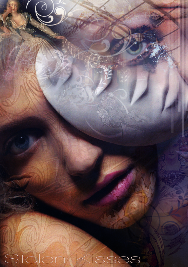
Loie Fuller

More on the Movement

Research is underway for the 'Stolen Kisses' drop, has the issue with themes been sorted yet? Check dom's post before this one if it hasn't!

xox Holly

Saturday, April 4, 2009

Tara

wow guys this looks amazing!!
i'm definitely keeping up with this because i'm so excited to see the final missive collection!
good luck with it all guys.
miss you all
xoxo
~tara

beautiful images!

well holly it seams that you have out done yourself yet again.
Great work now we just need to add Ashley's colour selections into the amazing pictures that you put together!

now we also need to re-clarify the story selection for each person because its important that the stories flow, don't you think guys?
now i was doing 'love letters' but if that's the theme people want to drop that's OK i will do Tara's theme and i think that love letters should still in some way be incorporated in out collections because it references a time and place that i feel it important to our mood and persona!
maybe we can all just keep it in mind or i can blend it into the end of me theme/story?
please let me know what you guys think, thank you!

love Domenica =) xoxoxoxoxoxooxoxo

Thursday, April 2, 2009

Missive Colour Arcs


The central colour pallette looks good, and ironically I had similar hues in mind when creating these "colour arcs" (I figured I'd group the colours in our pallette into seperate story arcs so that its clean and organised)

The titles are just representing the mood of the colour range, they arent based on any particular story. They are:

Harlequin- our basic colours of black and white, everyone thought these were essential in a range of intimates

Moody Hues- Play on the moody blues phrase, all the inky colours that people wanted earlier in the season

Silent movie- Since we looked at WGSN, it looks as though colours are moving toward more rich olive and red hues reminiscent of the interiors of old theatres.


I designed these to (hopefully) inspire you guys and to solidify colour ideas, so that proportionate pallettes can be created utilizing similar colours (by similar, I mean ashlee's =D). This way, we can alter the amounts of softs and darks depending upon where we drop in the season.

xoxo Holly

PS: Gave the blog a little spring clean, hope you like it, if not I'll change it back ;)

Wednesday, April 1, 2009

ashley's colour palettes

I absolutely love the second one, th eone in the middle is the best and i think we should work with that.
i hope other people like it!
thanx for doing that ash!

love Domenica

The Missive Details

Hey team!
Feride sent us all an updated version of our Design Brief. Under "Research for Design" there are points about our target market and everything that we have addressed as a group but not written out as a company statement. I'll write one up and post it on the blog but feel free to edit it. I think this along with our colour palette will really help us to design more effectively if we all have the same solid starting point.

Ashle xoxox